

Bitterbar Branding
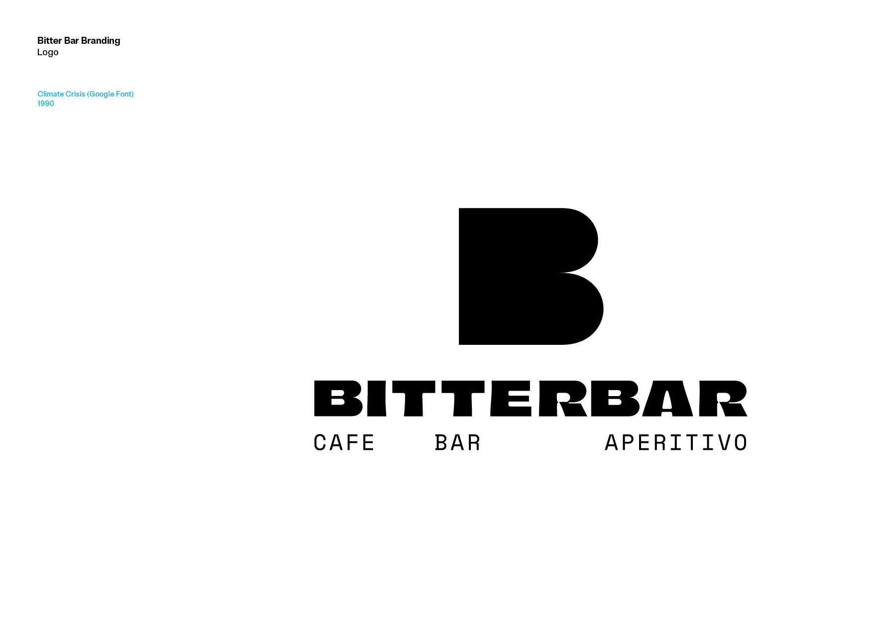
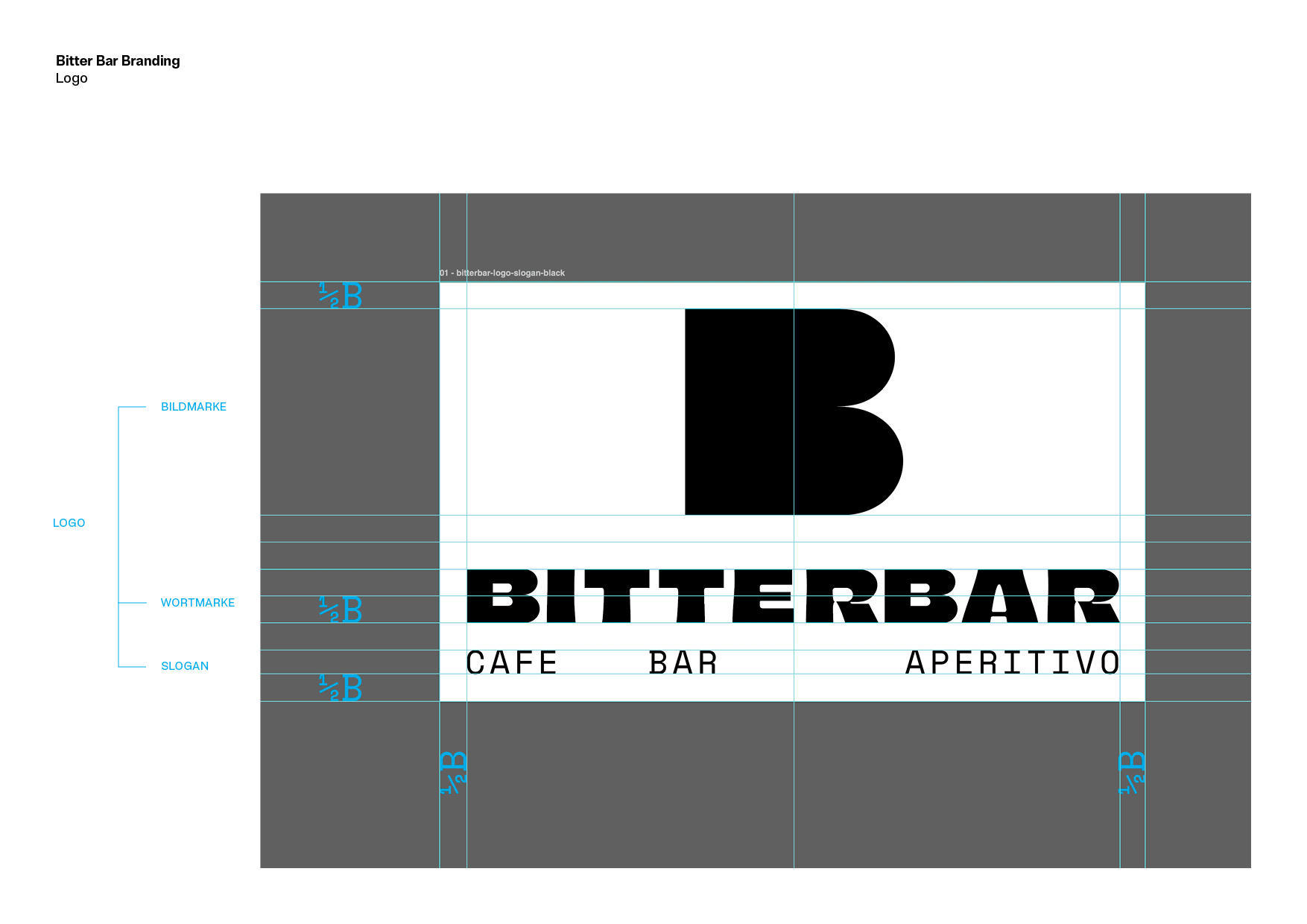
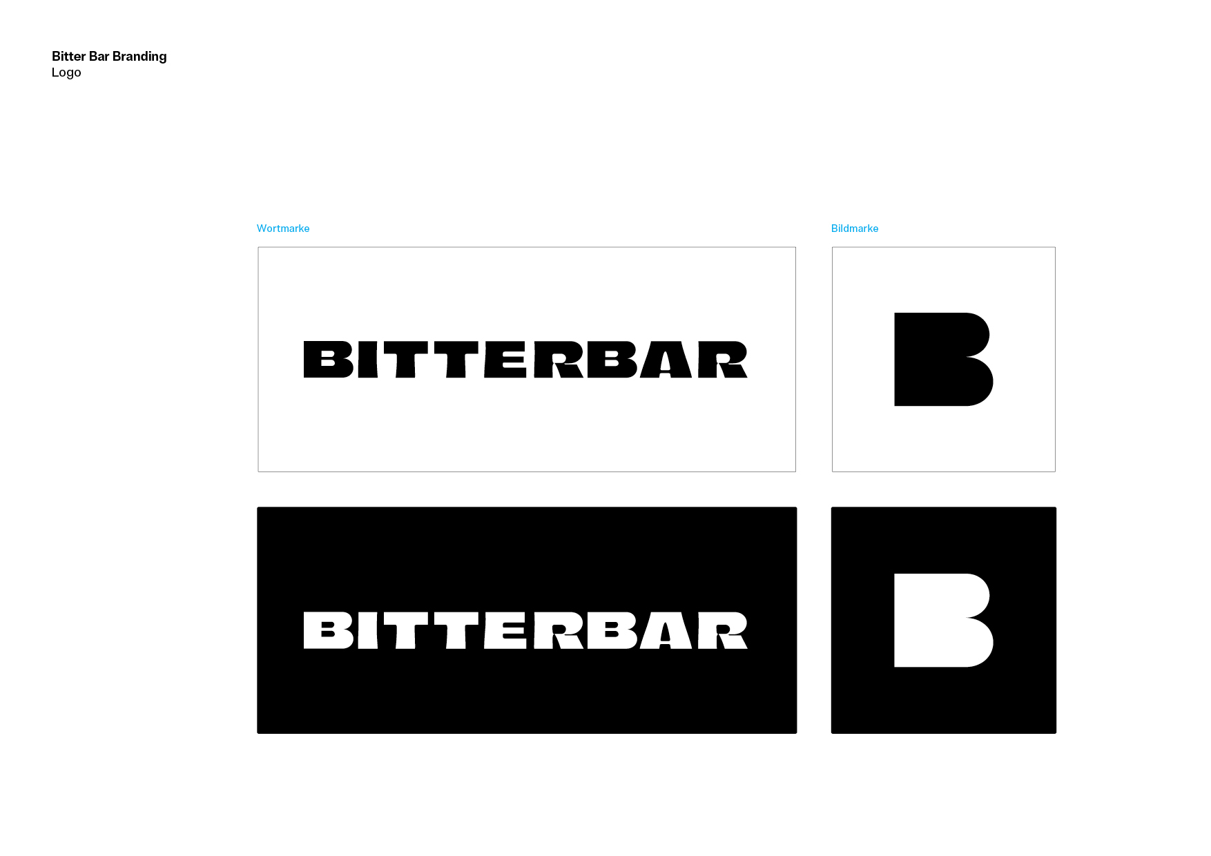
The visual identity takes a minimalist, brutalist approach. The logo plays with the word itself, turning BITTERBAR into a strong typographic statement with a distinctive B at its core.
The slogan «BESSER BITTER» captures the attitude of the brand in two words: confident, playful and unapologetically bitter.
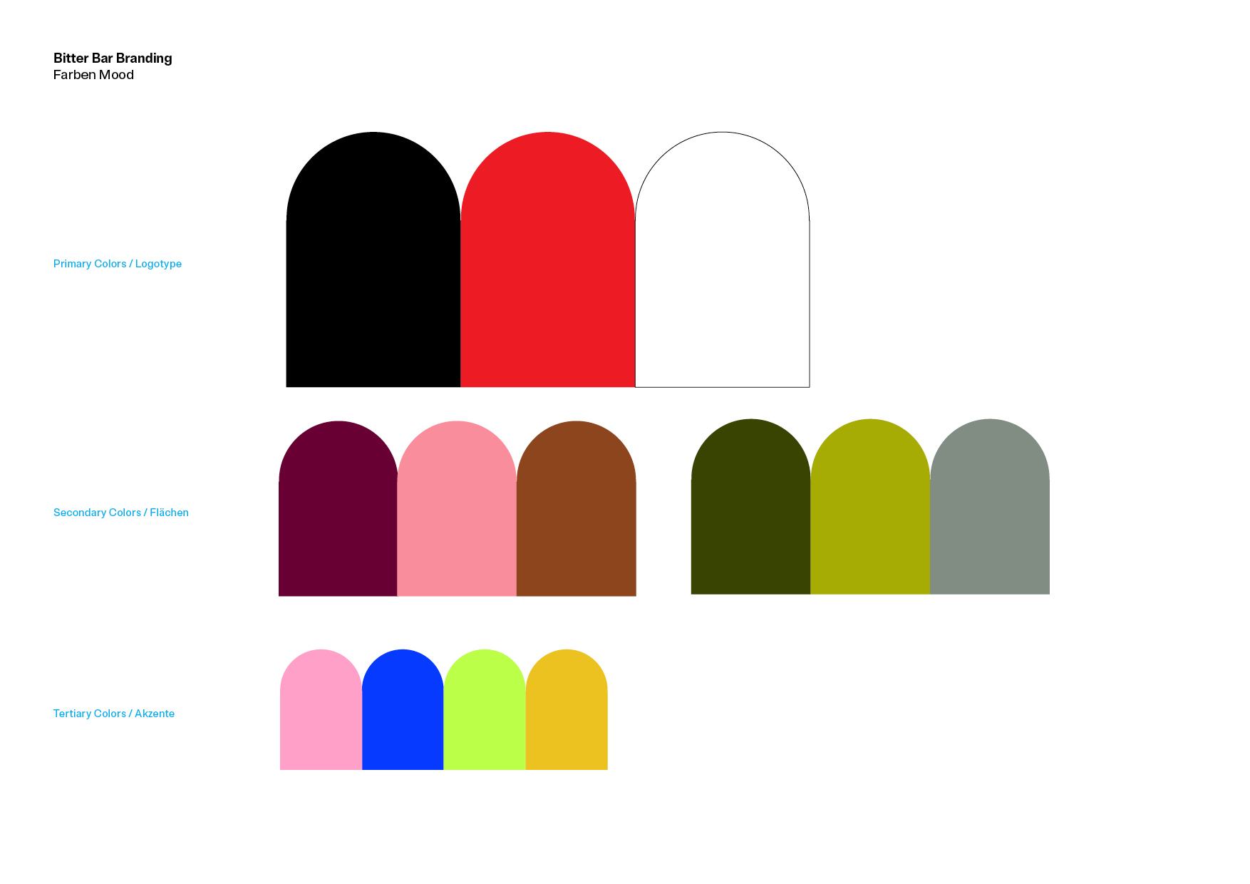
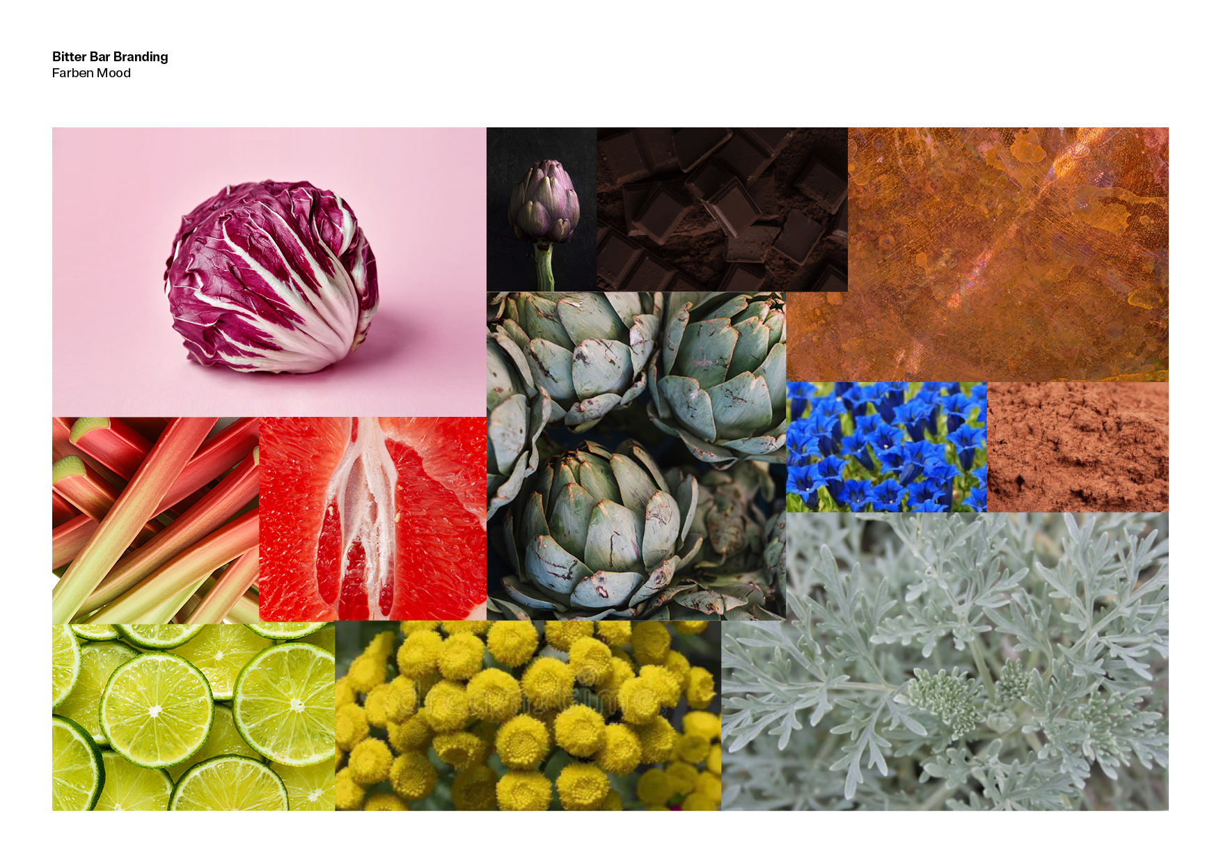
The color palette is inspired by the ingredients and flavors surrounding vermouth and aperitivo culture — radicchio red, artichoke green and sharp citrus tones — colors that give the identity its contemporary edge.
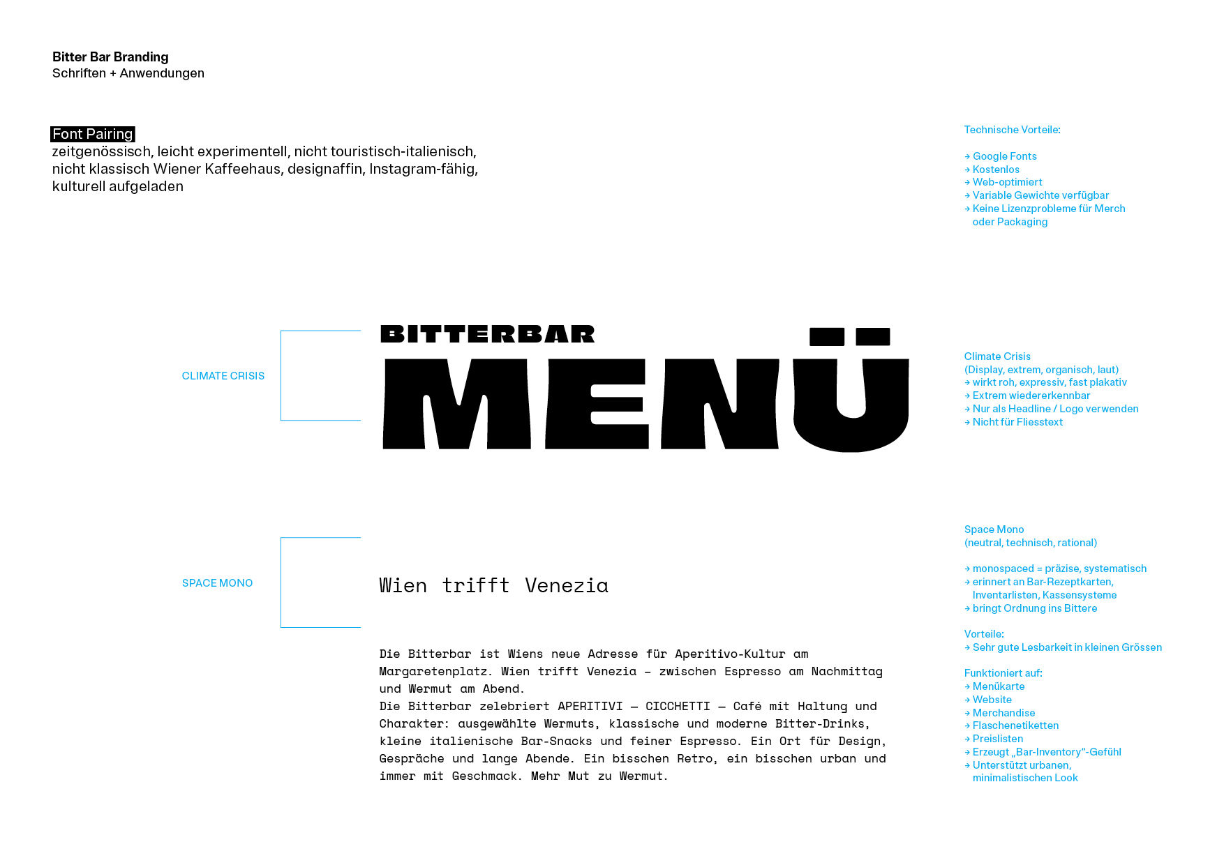
A bold grotesque typeface is paired with Space Mono, adding a functional, slightly raw character. Together, typography, color and reduction create a visual language that feels urban and modern while referencing BITTERBAR’s focus on vermouth, bitter aperitifs and Viennese bar culture.