- No products in the cart.
- No products in the cart.
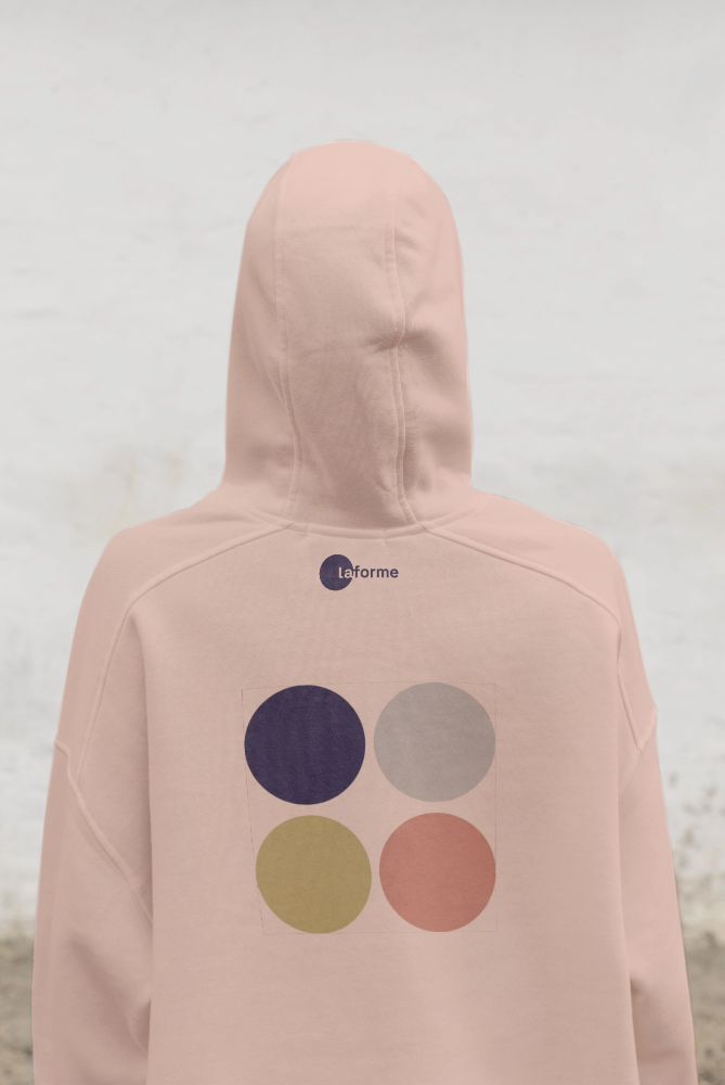
Laforme – Rebranding a Physio · Pilates · Yoga Studio approached me with the wish to unify its offerings of physiotherapy, Pilates, and yoga under a clear and modern identity. The goal was to develop a strong brand presence that communicates trust, professionalism, and holistic well-being – while appealing to both medical and lifestyle audiences.
Strategy:
The name plays with the dual meaning of form: the physical body and the state of being in shape. It captures the studio’s philosophy – a space where therapy, movement, and balance come together to create sustainable health.
Logo:
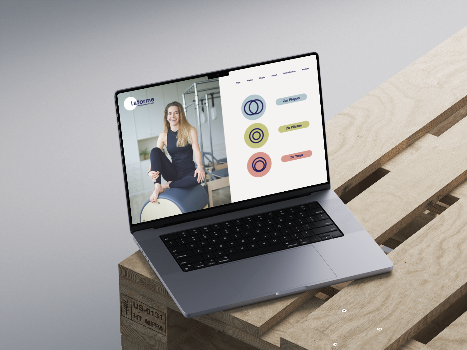
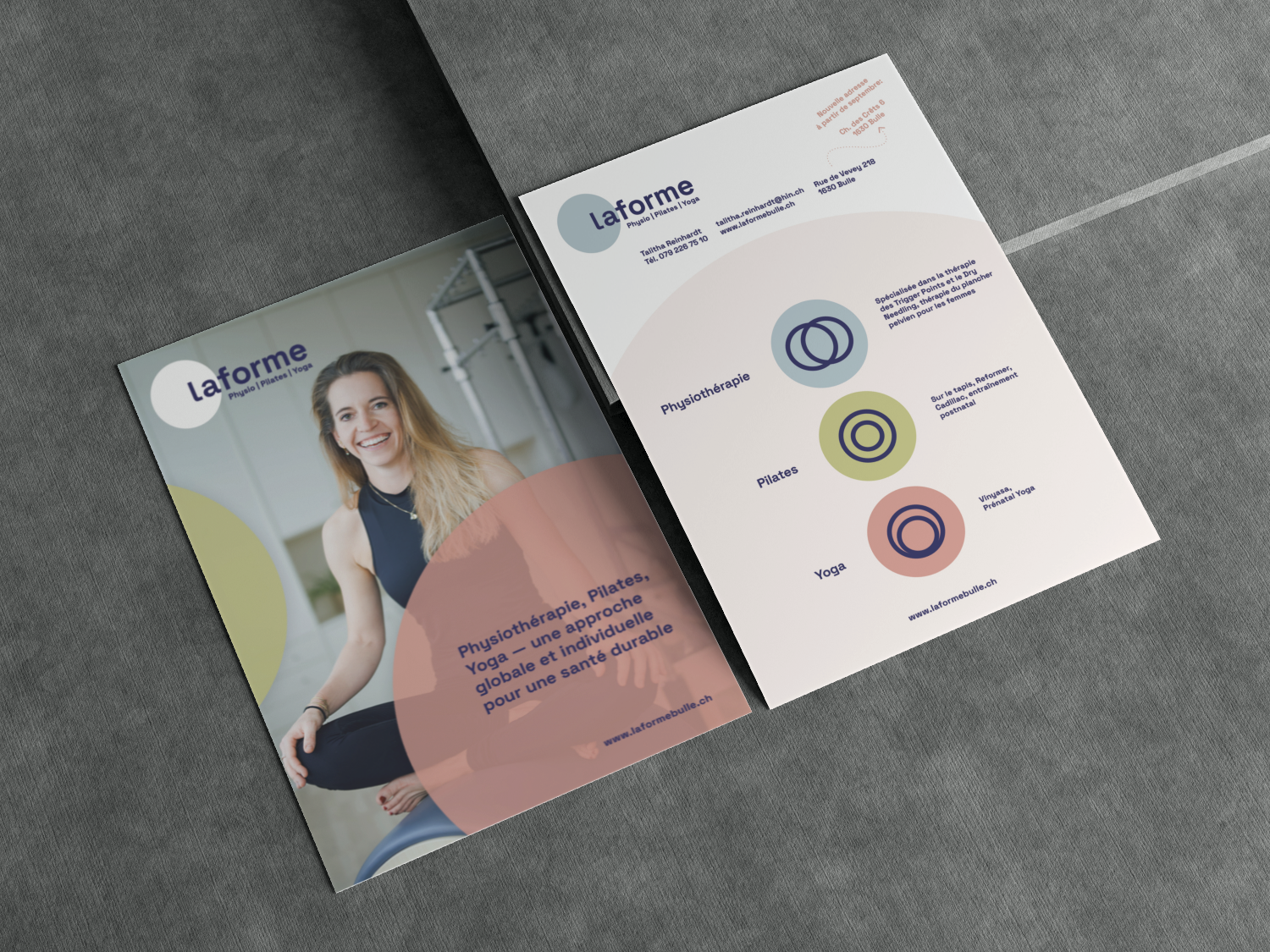
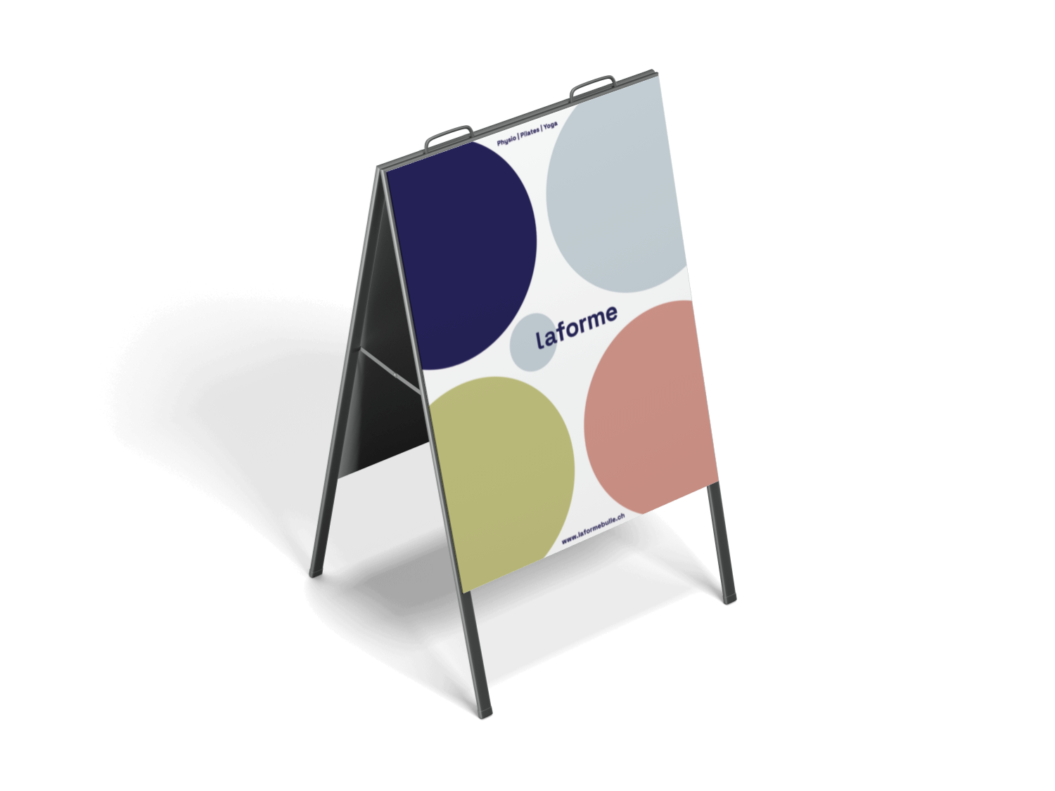
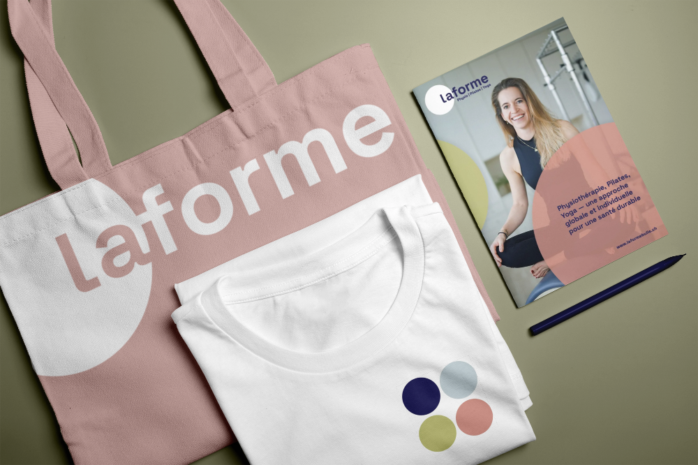
A clean, lowercase wordmark with a strong but soft typeface. The circular element around the “La” signals completeness, continuity, and balance.
Color Palette:
Muted yet characterful tones – deep navy, dusty rose, olive green, and a soft sky blue – form the foundation. Together, they convey strength, serenity, and a grounded, natural feel, distinguishing the studio from the sterile whites and cold blues typically found in medical branding.
Symbols:
Three geometric circle icons were developed to represent the three pillars:
Physiotherapy:
intersecting circles = connection and alignment
Pilates:
concentric rings = core strength and structured movement
Yoga:
fluid overlapping circles = flow, breath, and inner balance