0
0 items
CHF 0.00
- No products in the cart.
0
0 items
CHF 0.00
- No products in the cart.
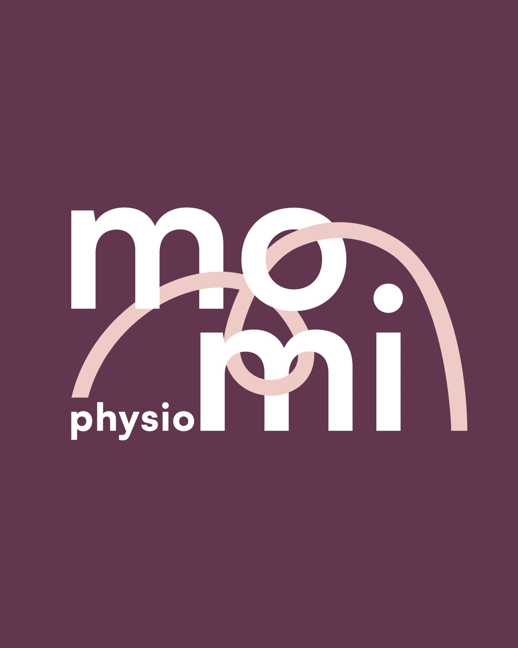
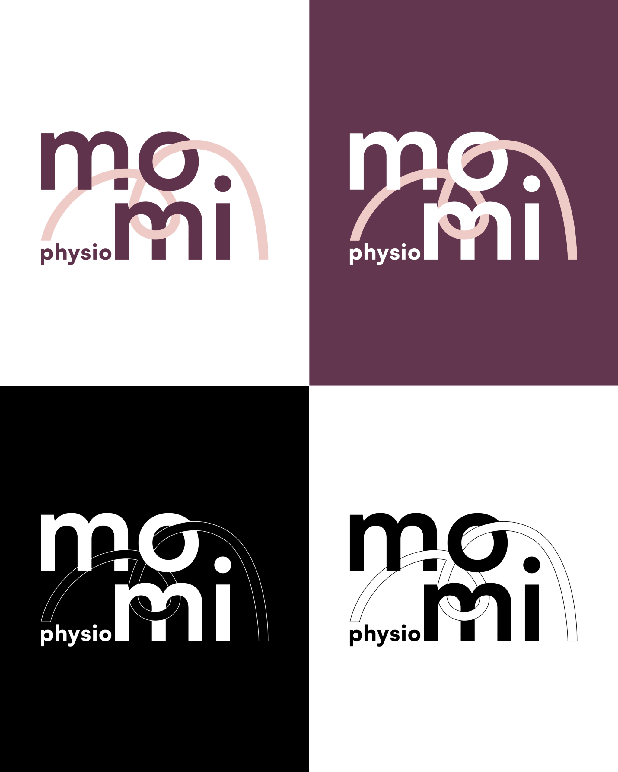
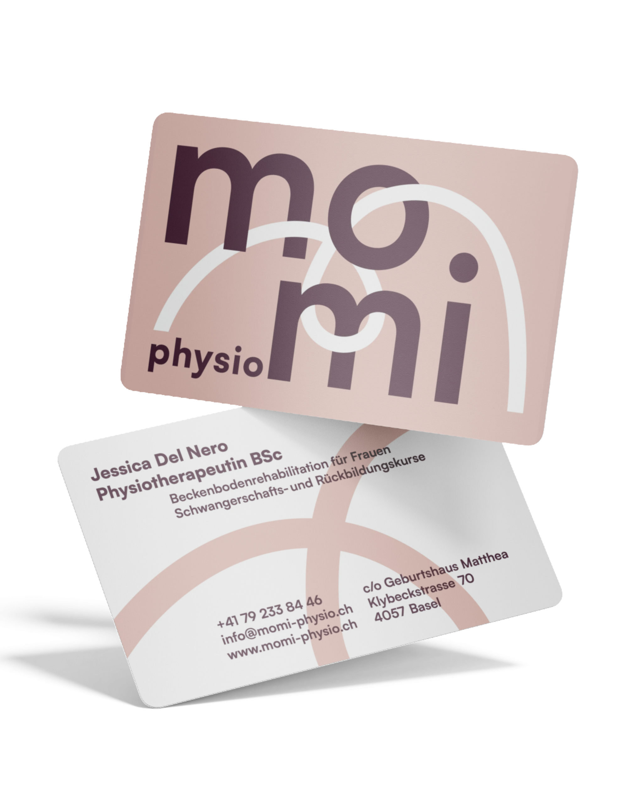
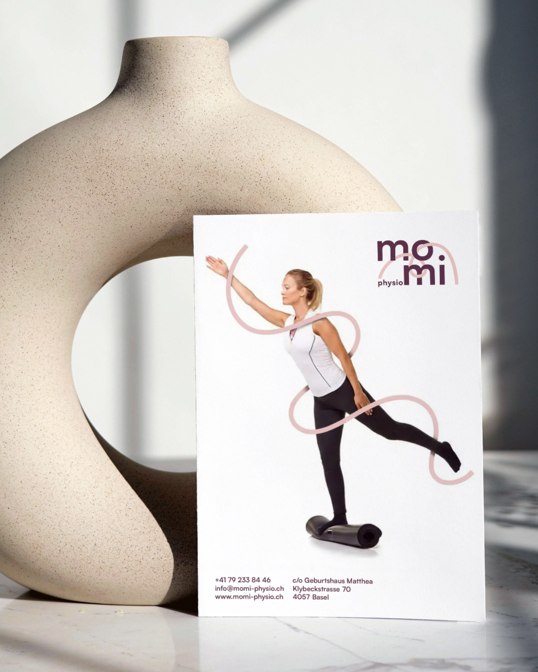
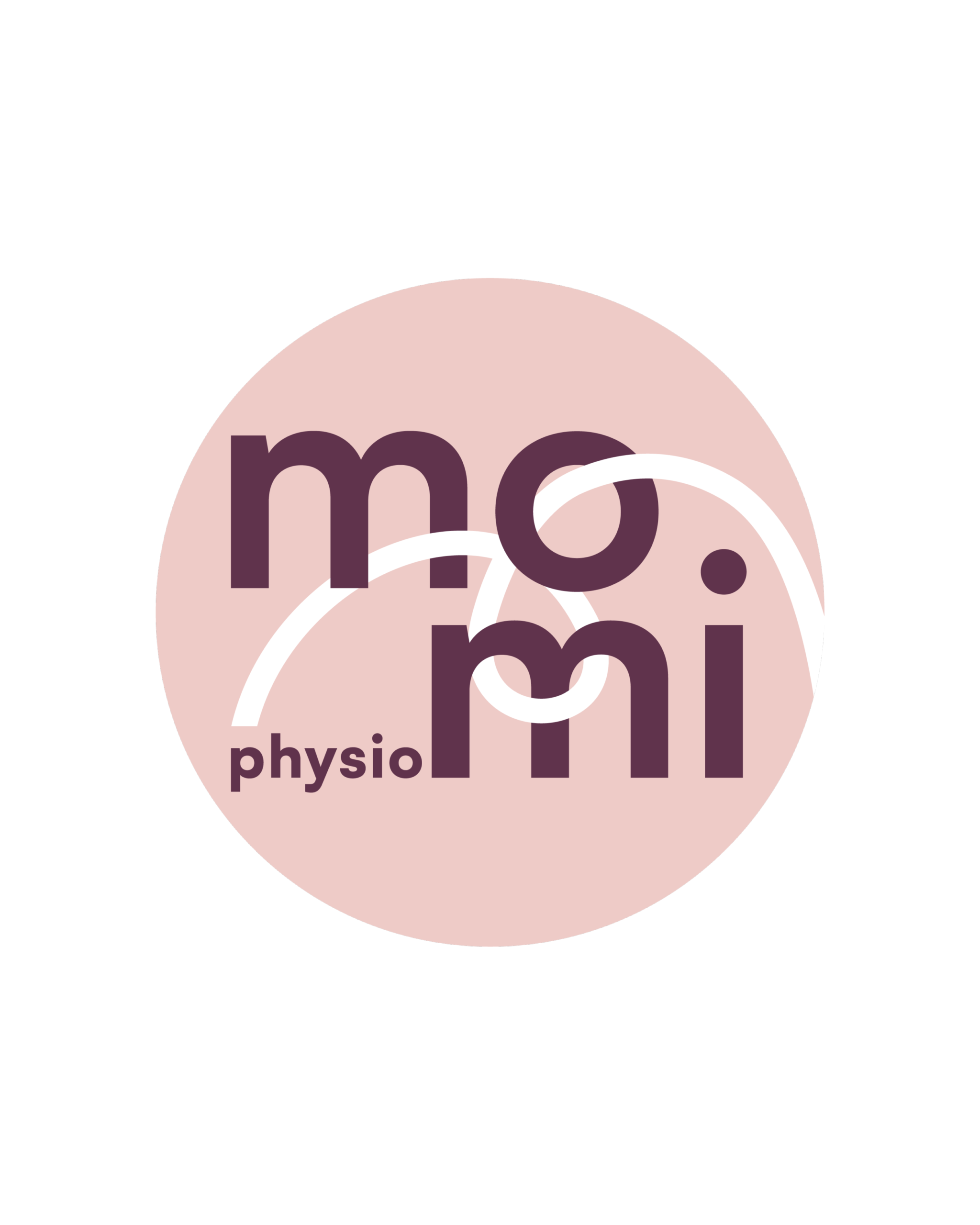
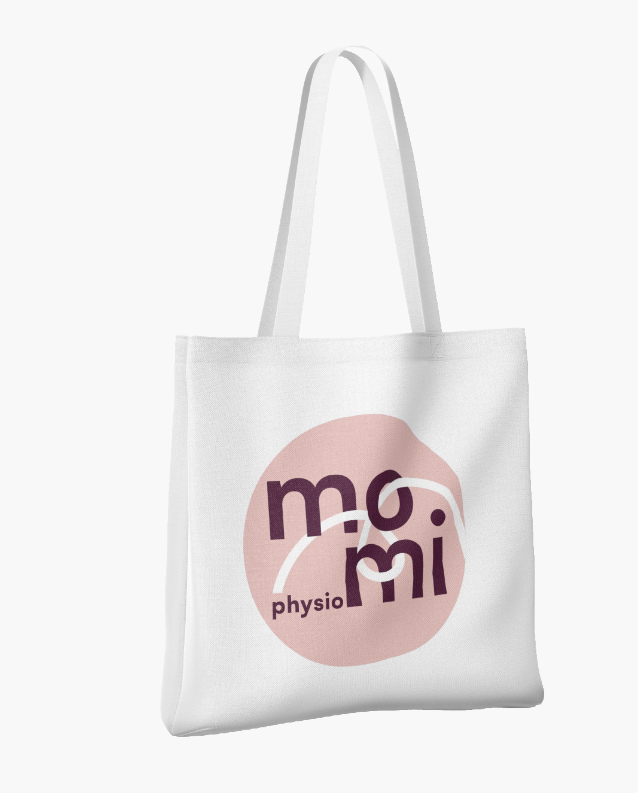
momi physio
A visual identity for a physiotherapy practice built around the idea of mind × motion.
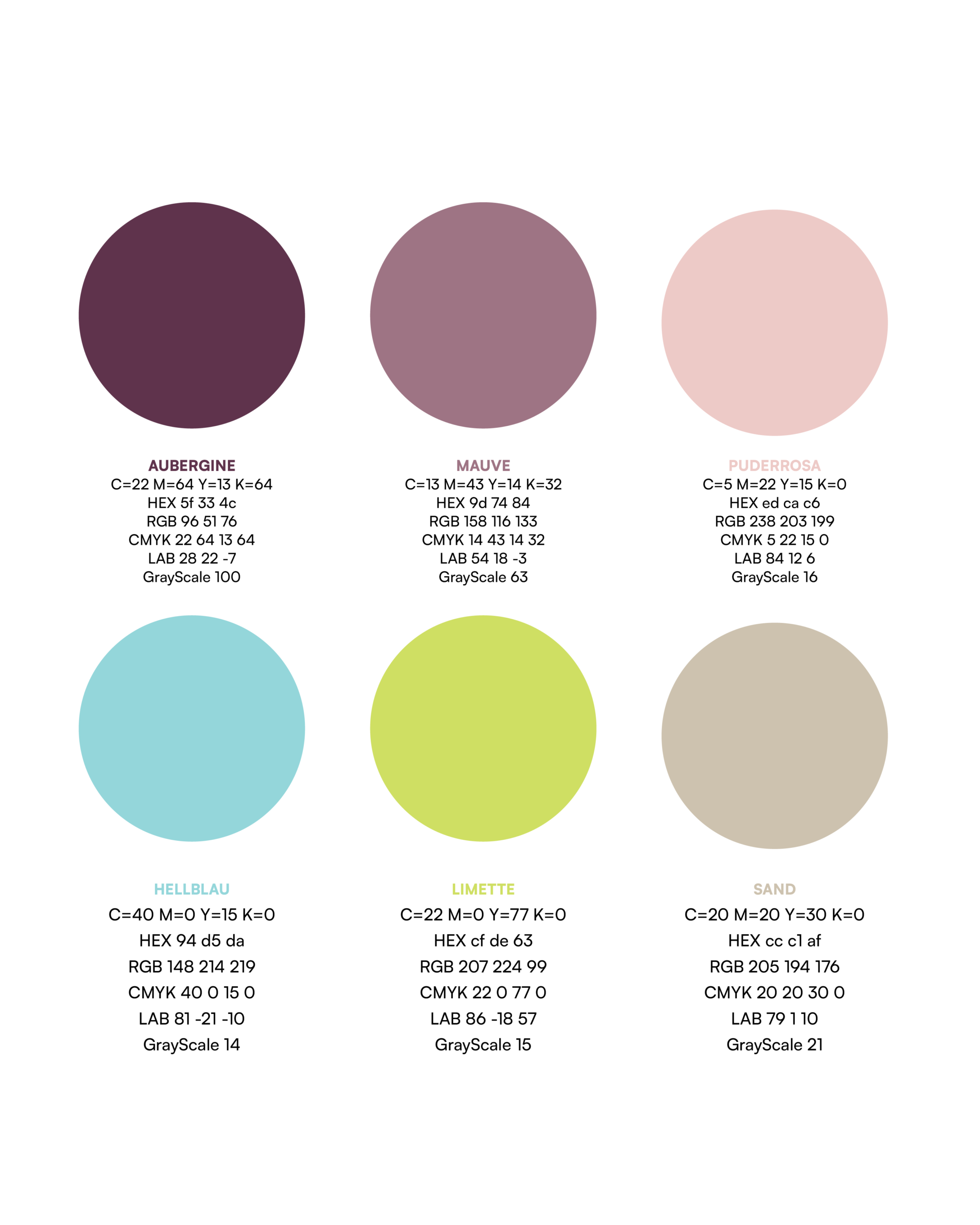
The logotype is a geometric sans-serif font with a continuous band that moves through the letters. This element reflects the core principle of physiotherapy: the balance between tension and release, control and flow, patient and therapist. The colour palette is calm and nuanced. Powder rose forms the base, complemented by mauve and aubergine for depth. Fresh accents like lime and light blue introduce subtle energy without disrupting the overall sense of balance.
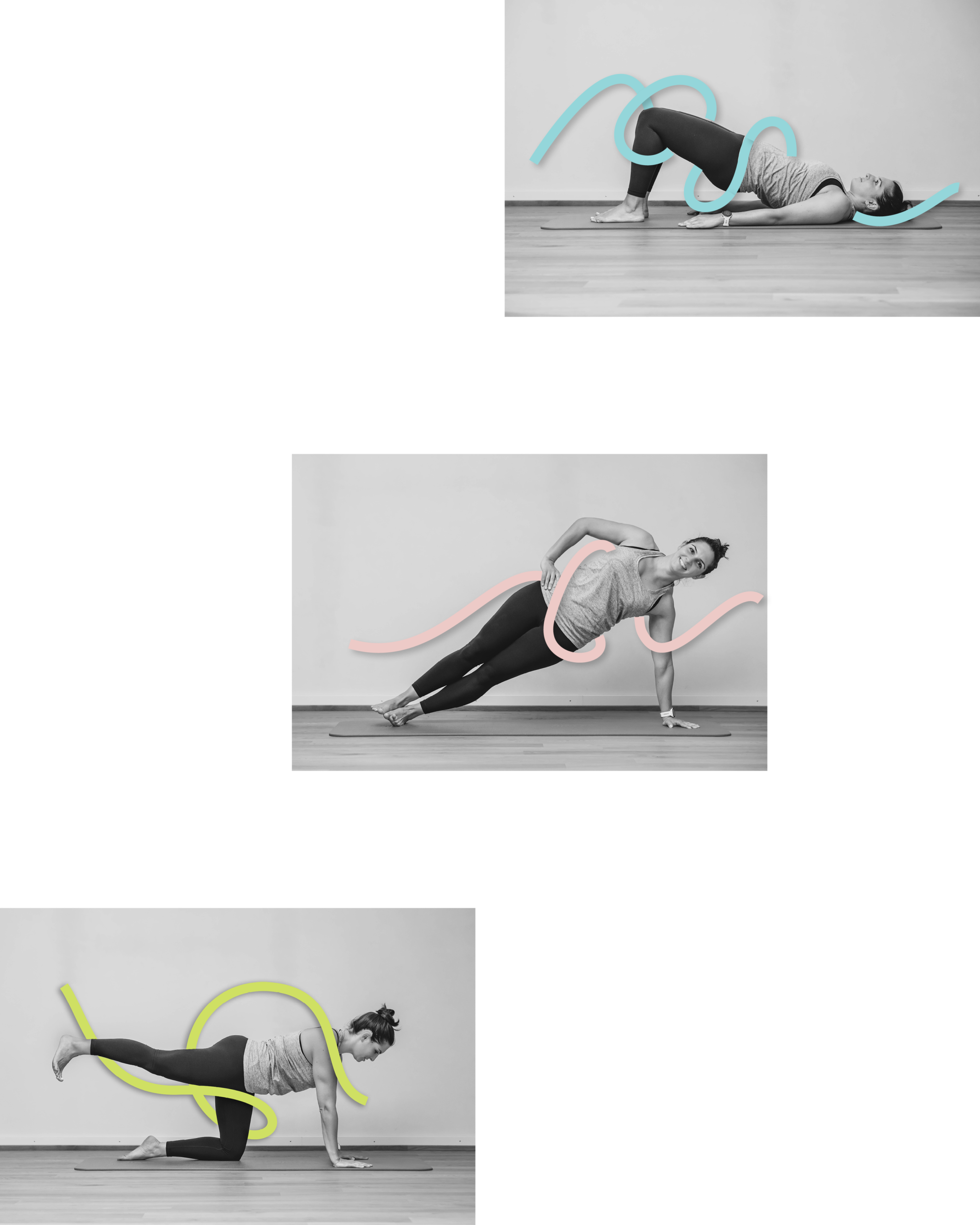
The identity extends across multiple applications
- business cards to posters
- digital touch points
- merchandise
- photography