Tree Time Logo / CD
Brand identity for a forward-thinking plantation / reforesting company. The essence of nature and growth is encapsulated in my minimalistic logotype, seamlessly merging with the organic form of a tree to create a powerful figurative mark.
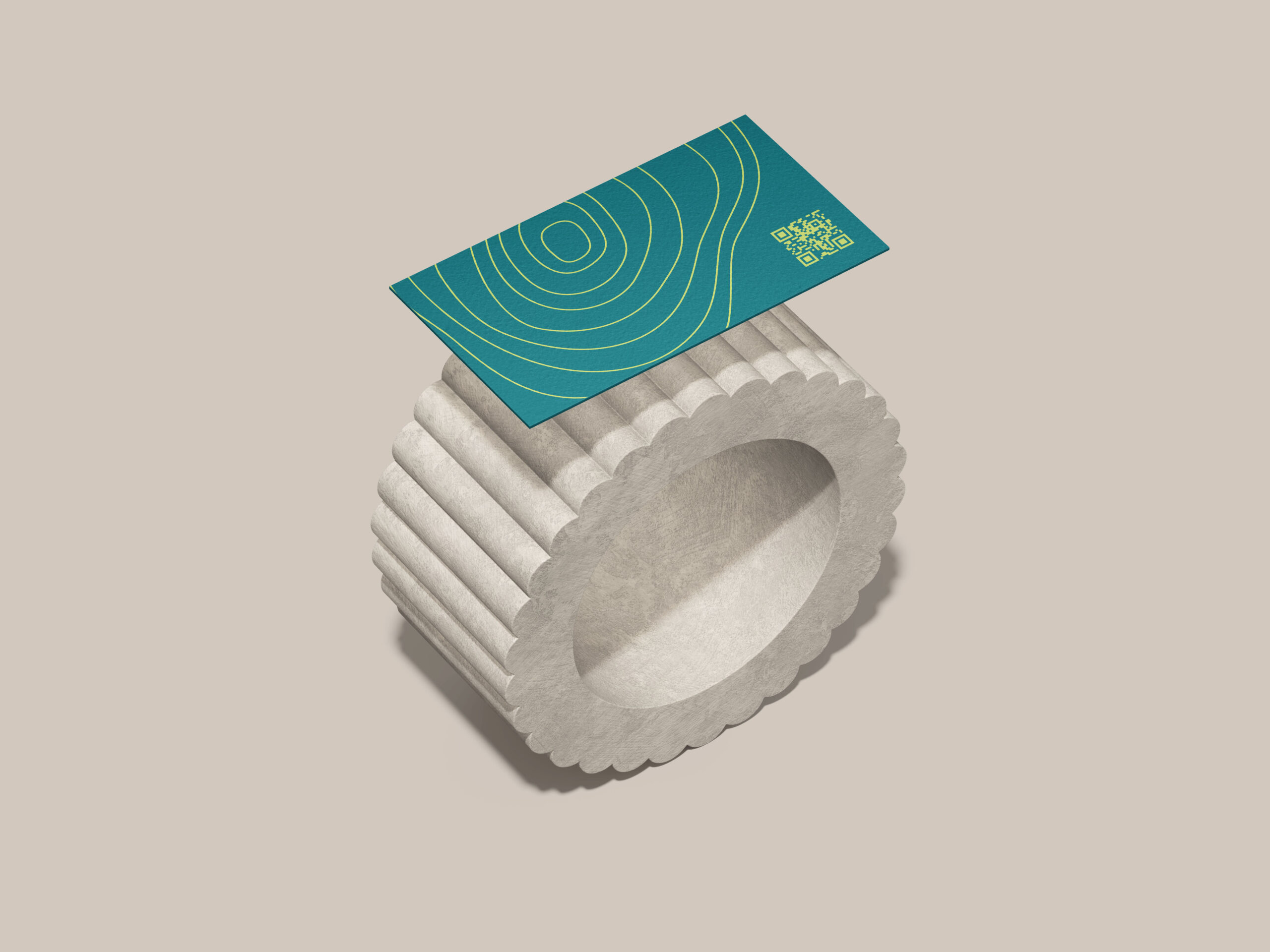
The monoline ring, incorporated into the design, symbolizes the stages each tree gracefully traverses. This corporate design extends to a thoughtfully curated primary and secondary color palette, complemented by a distinctive typeface.
Beyond the logo, I extended my expertise to elevate the company’s stationary set. From a business card that makes a lasting impression to a letterhead exuding professionalism and a brochure that tells a compelling story, each piece echoes the brand’s commitment to sustainable practices.
At the heart of my client’s mission is the cultivation of timber with a significant diameter, a process requiring patience and foresight. With a growth span of 20 to 30 years, this tree not only provides high-quality wood for various applications but also contributes to a substantial reduction in the carbon footprint. Embrace a brand that stands for longevity, sustainability, and a commitment to a greener future.